


Many new visitors come to your site every day and there is every chance that they will fall in love with the brand and become regular loyal customers. However, a good but inconvenient platform can make them go to competitors within minutes. No one wants to wander through a beautiful but illogical circle of pages, feel hopeless and waste time. And if, in addition, your site is not aesthetically attractive, people will leave it in just a few seconds. Effective UI/UX design helps to create both a beautiful and convenient platform. In all projects, we adhere to certain rules and principles of its development - and in the article we will share our experience.

Basics of UX/UI design
It is important for users that the interface not only appeals to them visually, but is also responsive to their needs, efficient and accessible. The site or application should load quickly, contain the necessary information, comfortable navigation and readability. Let’s figure out which of these questions are solved by each type of design.
- UX (User Experience) is the user experience, which it will be, depends on how easy or difficult it is for a person to interact with the interactive elements of the interface. The use of the site or application should be intuitive, the navigation should be logical, and the visitors should get the feeling that they are effectively completing the tasks set before them. UX design is the creation of exactly such a sequence of actions that leads the user to his goal with minimal effort and without obstacles. UX designers think about what and how people will use the product in order to build an easy and pleasant visitor journey on the website or application.
- UI (User Interface) is a user interface. It consists of all elements of the site or application with which the user interacts - windows, icons, buttons, animations, etc. UI design is the design of a website or application. UI designers decide how the application will look visually: color, shape and size of all interactive elements, line width, fonts, animation, pictures. They are responsible for the aesthetics of the interface, visual stimulation of the user, compliance of the graphics with the topic, goals and tasks of the project.
Both directions are interconnected and solve a common task - to make interaction with the platform easier, more convenient and clearer for customers. When your site or application does not cause difficulties for users and helps them solve their problems with maximum satisfaction, they return to you more often and pay more willingly. UX design helps you provide better services, and UI design helps you present them more clearly and pleasantly. As a result, you get a number of advantages:
- increasing the conversion of each visit;
- constant flow of customers;
- increase in sales and profit;
- increasing brand loyalty;
- attraction of a new audience;
- business growth.

Rules of convenient, beautiful and understandable site design
In order to get all of the above advantages from the design, in the process of working on it, you need to follow certain principles and avoid common mistakes. Let’s take a closer look at several basic rules for creating an aesthetic, convenient and understandable web design.
Page loading speed
It may seem that this is a question exclusively for Back-End specialists - but it is not quite so. If you overload the site with widgets, animations and videos, the loading speed slows down. Not everyone has the patience to wait, half will simply leave the resource without getting acquainted with the information. On the other hand, without graphic effects, the site will be a boring gray sheet of text that no one will read. We advise you to look for a golden mean: graphics without fanaticism. If you are going to make an animation, it should be minimalistic and not annoy the user with waiting.
Ease of use of the site
- It is important to think through the interface so that it does not burden the user with thinking. Usability consists of many parts, here are just a few of them:
- The main information should catch the eye immediately, and secondary content should be presented in small print or in the background.
- Design the navigation so that the user always understands: where he is, where he needs to go, and how to get there with the minimum number of actions. Getting to the right information or product in no more than three clicks is a UX law.
- Visited links should change color. Understanding where the user has already been helps them decide where to go next and frees them from wandering through the same pages.
- Check the link. The user experience becomes negative as soon as the link throws a 404 error (the page does not exist).
Readable fonts and moderate color palette
Fonts and colors should be selected in such a way that they support the content and do not take away all the attention - otherwise the visitor will not notice useful information. There should be a maximum of three different fonts on the page at the same time. One is for big headlines, the second is for body text, and the third is for points that should stand out (call-to-action, quotes, etc.). The same rule applies to the color scheme, but shades and halftones are allowed.
More visualization
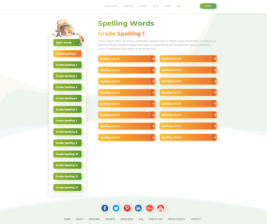
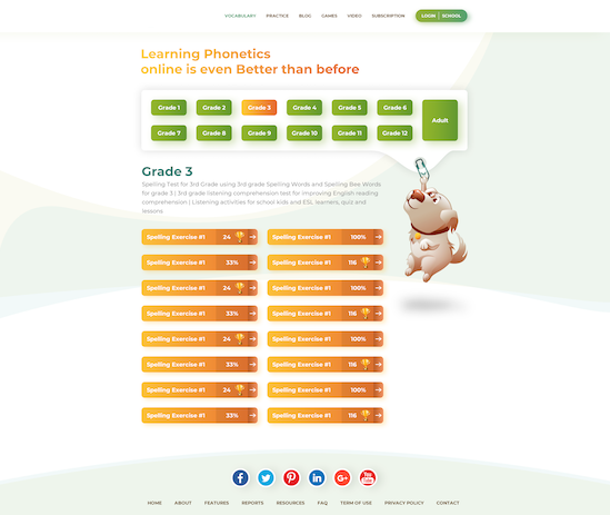
If there is a lot of information on the site, make life easier for users: use icons. Use only clear common buttons to avoid confusing the visitor. For example, icons for social networks, a house for the home page, magnifying glasses for searching, a shopping cart, etc. Especially if the site is aimed at sales - because the purchase process should be as easy as possible, so as not to lose the desire to buy.
Adaptive layout
More and more people access websites from different devices - laptops, tablets, smartphones. Therefore, it is important to make not just a mobile version, but an adaptive one - which is equally well displayed and read from all devices. Convenience and comfort of use should be preserved, no matter where a person enters.
Trends of high-quality Front-End development
Businesses that want to stay competitive and grow should consider modern web design trends, but do so thoughtfully. Stanislav Shcherbin, Golden Team partner and owner of EVIS Design Agency, shared his vision of interface design trends.
According to Stanislav, UX design has certain tasks that cannot be called trendy. Because they were relevant 10 years ago, and today, and in 20 years they will not change. Therefore, when we talk about trends, it is only about UI design. And here are currently popular:
- Dark theme. Depending on the field, clients of design agencies choose only black colors. However, Stanislav suggests that companies still make a light version of the design in order to test it on their customers and understand what suits them better.
- Less text, more photos and illustrations. People stop reading, perceive more and more with their eyes. So, instead of text, make an eloquent image, by which a person will understand in a second what he would have read for several minutes. However, you should not completely forget about the text content, because it also plays its role and should be on the pages.
- Rounded corners of interfaces, buttons and other design elements. They are less irritating to the eyes than sharp ones and require less effort for visual perception.
In general, trends depend very much on the subject and field of activity - each has its own requirements for the appearance of the platform. For example, if this is a site about travel and recreation, then definitely a white background and a lot of bright colors. Any activity related to crypto-currency, blockchain shows up nicely and gains trust due to the dark design. For legal or financial companies, frivolous 3D illustrations and animations are not suitable, but only serious, solid photos. But in the case of smartphone sales, three-dimensional illustrations will work great. If this is an e-commerce site, then a white page with monotonous content should have bright buttons with a call to action (purchase).
The design of your mobile and web platforms is a critical tool for the effective operation and growth of today’s business. Golden Team knows how to make it beautiful, easy to understand, convenient - and ultimately make people fall in love with your brand. We offer website design development services from scratch or website redesign. Leave a request for a free consultation. Our specialists will listen to you, analyze the idea, goals and objectives of the project - and offer a choice of suitable design options.